Recently, when I was visiting clients and visiting exhibitions, I discovered an interesting phenomenon. Nowadays, in every technology company, industrial park or smart exhibition hall, the signs at the door want to write "I am very high-tech" on their faces. They are full of luminous characters, cool colors, geometric cuts, and light strips. At first glance, they look very cool, but sometimes, I stand there and can't find the direction - which blue halo is the entrance sign hidden behind? The floor index took me a long time to figure out like a puzzle game, which made me wonder, did we sometimes go astray when designing technology advertising logos? In the preoccupation with "showing off skills", the most basic function of the logo - "clear guidance" has been forgotten.
.jpg)
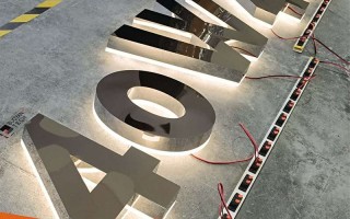
The sense of technology should not be just a pot of condiments. Everything is added to it. Many so-called "tech style" logos on the market now fall into several typical misunderstandings. One is "abuse of light". They think LED is technology, so they use internal lighting, external lighting, and breathing lighting effects regardless of the occasion. They look pale and feeble during the day, and dazzling at night. The information is drowned by the light. The other is "form" Supremacy", excessive pursuit of abstract shapes, asymmetrical structures or minimalism to just one symbol may look very artistic, but users need quick understanding and are not here to appreciate contemporary art. I have seen a laboratory logo that uses geometric hollows and superimposed projections. The concept is "deconstruction of knowledge." As a result, eight out of ten visitors can't find the safety exit sign, which is putting the cart before the horse.
So, what is a good technological logo design that truly serves function? I think the core idea needs to change: Instead of using logos to display technology, use technology to optimize logos , there are a few key points that can be discussed here.
.jpg)
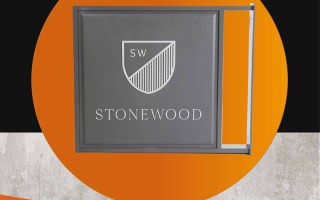
The material must be able to "speak"” , The sense of technology does not have to be cold metal and acrylic. Nowadays, many new materials are very interesting. Translucent concrete usually has a calm texture. At night, the internal light guide material can make the guidance text appear softly. The looming surprise is better than straight The large light box provided has more charm. Another example is the smart dimming glass, which usually provides a clear guidance screen. When needed (such as issuing important notices), it can be switched to screen mode. One material has multiple uses, combining dynamic and static. If the material is selected correctly, the texture itself conveys cutting-edge and innovative signals.
Interaction is the essence, but it must be "effective interaction"” , the biggest advantage of technology-empowered signs is to make static signs "alive", but this interaction cannot be a showpiece. If a smart guide sign in a park just uses gestures to switch between several cool interfaces, it is better to make a responsive touch screen that can quickly navigate the map, search for destinations, and display Real-time paths, further combined with AR technology, allow users to scan signboards with their mobile phones and see real-life navigation superimposed with directional arrows on the screen. This solves the "last meter" problem of finding a way. The key to interactive design is to reduce the cost of understanding and improve the efficiency of obtaining information, rather than increasing the difficulty of operation.
.jpg)
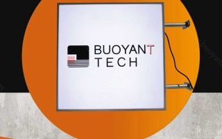
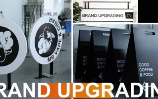
Dynamic information and systematic thinking Once a traditional sign is put on the wall, the information is fixed, but the internal space of a technology company may be constantly adjusted. Today it is the R&D department, but tomorrow it may become a project team. At this time, a sign system composed of an electronic ink screen (E-ink) or a small LED screen would be great. The content can be remotely and centrally managed and updated at any time to maintain the absolute accuracy of the information. More importantly, there must be systematic thinking in the design. , from the outdoor overview to the indoor partitions, and then to the door number of each room, a visually coherent and logically clear "family design language" is needed. The colors, fonts, and icon styles are unified, but the hierarchy is reflected through changes in size, material, or lighting. From the moment they enter the park, users feel like they are talking to a logical intelligent system and arrive at their destination smoothly and without feeling. This is the advanced sense of technology.
Don’t forget the “human touch”” , Technology is cold, but the target of service is people. A good sign with a sense of technology should have a "restrained friendliness". The color temperature of the light can be a neutral light of about 4000K, which is clear and warm. ; The interactive interface has clear and common sense feedback (such as sound or vibration prompts after clicking) ; Set up eye-catching, no-thinking guidance at key decision-making points (such as forks in the road). Why does the design of the Apple Store make people feel technological and comfortable? Because it hides complex technology behind an extremely simple and intuitive design.
Ultimately, the essence of signage is Information communicator in space , technological design should be to put on a more decent, smarter, and more efficient coat for the communicator, so that it can better complete the mission of communication, instead of putting on a cold, obscure, and distant "technological mask". Before doing design next time, you might as well ask yourself: Does this design make information transmission simpler or more complex? Does it make people feel convenient and surprised, or confused and alienated?
Let technology return to the nature of tools, serve people, and serve clear information transmission. Even if the shape of such a logo is not so "explosive", the ingenuity hidden in the details and the in-depth consideration of user experience are the truly viable "sense of technology" that can withstand the scrutiny of time. After all, the best technology is when people do not feel the existence of technology, but enjoy its convenience everywhere, and the same should be true for logo design.


