Every time you walk on the street or drive past an intersection, those various signs are always conveying information silently. Some people can remember them at a glance, and even can’t help but look at them a few more times. ; Some are like background boards, drowned in visual noise at a glance. Over the years as a website editor, I have been exposed to many topics on signage design and production, and have dealt with many advertising signage companies like Rongmei. I often wonder, what is so "good" about a good sign? Is it enough to just make the name and phone number big enough and the lights bright enough? I'm afraid it's not that simple.
The name Rongmei is not unfamiliar in the local advertising signage circle. I have chatted with their team several times and seen many of their cases. I found that they have an interesting starting point for their design.: They are not just making a "brand", but helping customers build a "visual contact point"” , this sounds a bit mysterious, but to put it bluntly, when customers see this sign for the first time, they receive not only what you call it and what you sell, but also a feeling, a trust, and even an urge to come in and take a look.
For example, the door sign of the newly opened boutique cafe on the corner is made by Rongmei. Instead of using the common dazzling LED characters, it uses a matte dark bronze metal base plate with handwritten-style luminous characters. The light is warm yellow and bright. It’s adjusted just right. It looks particularly warm at night, like the light coming from the window. There’s a simple coffee bean relief pattern next to the font. It’s just such a design. There are no advertising slogans such as “top coffee” or “freshly ground and mellow”, but people passing by can probably feel it.: This store should be quite stylish. The coffee may not be cheap, but it is worth a try. You see, the sign is here, and the first "brand dialogue" has been completed before the barista and decoration.
.jpg)
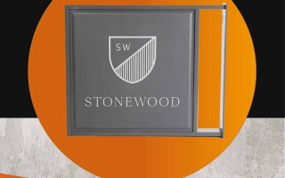
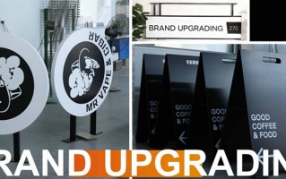
This is actually the core value of signage design—— It is the condensation of brand image and the "first sentence" of commercial space.” Rongmei's designers shared with me that when they receive a case, especially for a new brand, they may spend more time on early communication than drawing. They have to understand the boss's original intention of opening the store, what kind of people he wants to attract, what the atmosphere is like in the store, and even what the competitors' signs look like. They call this "digging out the roots." If the roots are dug correctly, the "leaves" that grow out later - that is, the visual design - will not be a cookie-cutter set of templates.
.jpg)
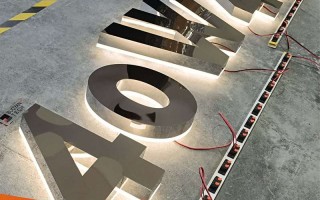
When it comes to production, this is a key step in "requesting" the design draft from the computer to the real world. It is also the easiest place to distinguish between "seller show" and "buyer show". Rongmei has its own factory, which I think is very important. It is not the kind of leather bag company that only takes orders and then outsources it. From design to cutting, welding, painting, assembly, and light source testing, Rongmei does everything in-house. When talking to their workshop masters right under the nose, the masters will point to a polymer composite material and say that this material is used outdoors and is much more resistant to ultraviolet aging than ordinary acrylic. Although the cost is a little higher, customers save the trouble and money of frequent replacements in the future. For lighting, they are now mainly promoting LED modules, but they do not blindly pursue the brightest, but pay attention to accurate color temperature and uniformity of light. “Some signboards look like candied haws of light when lit up at night, because the lamp beads are poorly selected or arranged unscientifically," the master said very honestly.
.jpg)
You see, it’s all about details and knowledge. A simple luminous word on the design drawing involves a series of issues such as structural load-bearing, waterproofing and heat dissipation, circuit safety, visual effects, etc. Good production is the guarantee for the design to be "safely implemented" and "lasting light". Rong Midea showed me a three-dimensional lettering on the exterior wall that was made for a restaurant two or three years ago. It has experienced several typhoons and exposure to the sun. Looking at it now, the color has not faded much and the structure is still solid. This kind of effort hidden behind it is the real "worry-free" that customers buy.
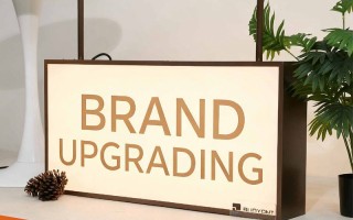
Times are also changing. Today's signage is no longer the era of iron sheets and plastic characters. Dynamic LED displays, interactive projections, naked-eye 3D effects... new technologies are emerging one after another. Rongmei is also trying to integrate these new gadgets into some suitable projects, such as interactive guidance signs in the atrium of shopping malls, or digital image walls at the front desks of technology companies, but they also mentioned a point of view: Technology is a means, not an end , you can’t show off your skills for the sake of showing off your skills, everything still has to come back to the effectiveness of information transmission and the fit of the brand tone, otherwise no matter how fancy you make it, it will be in vain if customers can’t remember what you do.
After talking so much, what I actually want to say is that the signage industry does not seem to have high barriers to entry, and the streets are full of advertising production. But if you really want to make a difference and make something that benefits customers’ business and adds color to the city’s streetscape, what you need is ingenuity in design and ingenuity in production. It connects commerce and art, as well as creativity and craftsmanship.
Next time you pass by a store sign that makes you stop, or feels particularly comfortable, you might as well take a second look. There may be a team like Rongmei hiding behind it. They start from "digging the roots", pondering bit by bit, repeatedly proofing and debugging, and finally put a cold piece of The "brand" has become a warm and talking "brand business card". This is probably the charm of sign design and production - using the most intuitive visual language to tell a story about who you are in a small space, and a good story will never lack an audience.

