I was on a business trip in Huzhou recently, and while waiting for the bus, I suddenly stared at the stop sign for a while. You name it, no one would take a second look at it, but if it were missing, or if it was confused or wrong, the whole street would probably be blinded. Hu This place is quite interesting. The alleys in the old city are narrow, the roads in the new district are wide, and there are many tourist attractions. A set of bus signs and signs must serve local citizens and foreign tourists, and it must also take into account the urban style. The road behind this may be much more complicated than we imagined.
.jpg)
First of all, we need to figure out who the bus signs are for? This question sounds simple, but it can easily go astray. In the early years, the stop signs in some cities were designed to be called "artistic", with abstract lines and extremely small fonts. It was difficult for young people to see them, let alone old people with bad eyesight. Huzhou has many problems in this regard. I have observed the signs of several major stations. The first principle is “Clear at a glance” , the station name is large and eye-catching enough, with black characters on a white background or white characters on a dark blue background. The contrast is strong and can be seen day and night. The route map is also regular. Different lines are distinguished by colors, and the arrows indicate unambiguous directions. Especially the transfer information will be marked with conspicuous symbols or colors to prevent you from missing it. This is to capture the core - the essence of bus signs. “tool” , is not a work of art. Practicality and readability always come first. The designer’s aesthetics must come back, and user convenience is king.
.jpg)
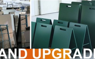
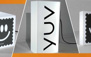
The material selection and craftsmanship are really a battle of wits and courage with the weather in Huzhou. In the Jiangnan area, spring and summer are humid and rainy, autumn and winter are cold, and there are occasional typhoons. You can get an ordinary spray-painted sticker and expose it to the sun and rain. It will fade, peel, and curl in less than half a year. It is still a small thing to look ugly. If the information is not clear, it will be a mistake. Huzhou’s current mainstream station signs mostly use high-strength aluminum alloy or galvanized steel panels. The surface is anodized or spray-coated to prevent corrosion and rust. The printing technology has also been upgraded and is commonly used. UV inkjet printing or screen printing , the color adheres firmly and has strong UV resistance, which can ensure that the color remains bright for several years. I specially touched several stop signs of different years. The newer ones feel smooth and solid, while the older ones have some traces of time, but the message is still clear. This kind of durability is responsible for public finances and a long-term commitment to the citizens.
.jpg)
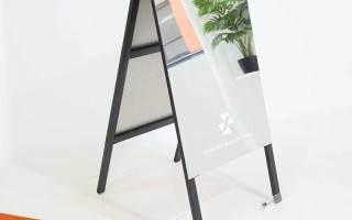
The details of installation and maintenance show real skill. Installation is not just about nailing it on. The height is very particular. It must take into account the perspective of adults, children, and even people in wheelchairs. Firmness is a top priority. It must withstand strong winds and shakes, and accidental collisions must also be considered (although we don’t want it to happen). I heard that some key road sections and stop signs near scenic spots in Huzhou have increased standards for foundation depth and concrete pouring. Maintenance is a systematic project. Line adjustments and station renaming are common things, and an efficient response and update mechanism is needed behind them. You cannot change the route for a month and still have the old information on the stop sign. This requires smooth collaboration between the bus company, the production unit, and the municipal department. Sometimes you see a temporary correction posted on a certain stop sign. Although it is a little unsightly, it at least shows that the update mechanism is working, which is better than the error message always hanging.
Thinking further, bus signs actually carry more "soft" functions. How does it fit into urban culture? Huzhou is the home of silk and Hubi, with profound cultural heritage. In some historical and cultural blocks or tourist routes, the design of bus stop signs will cleverly incorporate some local elements, such as simplified flowing water patterns, brush stroke font design, or celadon glaze as embellishment. These elements are used restrained and not noisy. It’s not the first guest, but a closer look will make people smile and feel the unique temperament of this city. It is also silently carrying out “urban education”. Some stations will come with a short introduction to tell you the historical allusions behind the name of the station and important nearby landmarks. You may be able to gain a little knowledge in the few minutes you wait for the bus.
Challenges always exist. As cities develop, new communities and new business districts continue to appear. How to scientifically arrange locations and predict the flow of people? Smartphone navigation has become popular. How can physical stop signs be optimized to complement digital information instead of being replaced? How to make nighttime lighting more energy-saving and more uniform? These are real problems facing designers and managers.
In the final analysis, the production of Huzhou bus signage is the result of a series of rational trade-offs and precise operations. It must balance functionality, durability, aesthetics and culture within a limited budget and space. It is like a silent and reliable guide in the city. It does not need fancy words, it only needs to be used when you need it. Provide the most accurate and clear information when necessary. You may wish to take a second look at it when waiting for the bus next time. This set of "mobile instructions" covering the entire city embodies real ingenuity and deep concern for daily life. Its evolution also records the growth and temperature of the city from one side.

