Hey, friends! Today we are going to talk about signage design. When it comes to advertising signs, you may think that this thing is just a board. You can just write a few words and draw a picture, but to be honest, it is not that simple! A good sign can make people see it from afar, and they can even stop and take a second look. If it is poorly designed, no matter how important the content is, it may be ignored by passers-by. This is not to scare you. How many of those dusty signboards on the street have you paid attention to?
Let me talk about my own experience first. When I first entered the industry, I also thought that signage design was just about combining materials and adjusting colors. When it came out, customers would always say it was "almost boring". Later, I gradually understood that for a sign, you have to think clearly about its purpose. Is it to be hung at the door of the store to attract business? Or is it placed in the factory as a safety reminder? Or is it just a guidepost? The purposes are different and the design ideas are completely different. For example, for a restaurant sign, you have to make people drool at the first sight. ; The signs of fire exits must be clear enough to be recognized even in thick smoke. This principle sounds simple, but many people are confused when they actually do it.
.jpg)
Okay, without further ado, let’s get straight to the basics. The first step in designing a sign is not to open the software, but to pick up a pen and paper—yes, the most unsophisticated way is to draw a sketch first! Don't worry about whether the drawing is good or not, just sketch out the general layout, text position, and graphic elements. I'm used to writing some keywords next to the sketch.: "Be eye-catching", "have a sense of technology" and "no more than three colors". These small actions can help you clarify your ideas and avoid repeated tossing later.
Speaking of color, this is a big deal. I have seen many signs with red and green, purple and yellow, which make people dizzy. In fact, there are ways to match colors, but just remember a few principles.: The contrast should be strong (such as a dark background with light characters), the tone should be uniform (don’t make it look like a color palette), and the environment must be considered - if you are surrounded by colorful advertisements, your signage will be more prominent with plain colors. By the way, don’t ignore the lighting effect! Many signs look beautiful during the day, but become blinding at night. If they have luminous characters or light boxes, you have to simulate them during the day and night to see the effect.
.jpg)
Font selection is also a technical job. Some designers like to use weird and weird artistic fonts. As a result, you can’t even recognize them from a distance. My experience is: Information signs (such as street signs and signs) are honest and practical and use clear fonts such as bold and Song fonts. ; Commercial signage can be a little more lively, but the premise is to ensure legibility, and don’t be sloppy with details such as word spacing and line height - it will look uncomfortable if it is crowded into a ball or scattered like a plate of sand.
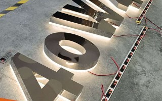
Novices are easily confused when it comes to materials and technology. Acrylic, stainless steel, PVC, LED...the effects and costs of each material are far different. For example, bright acrylic is commonly used in fast food restaurants and looks lively. ; Banks may use brushed metal characters to highlight a sense of stability. It is best to communicate with the manufacturer before designing to understand the local craftsmanship and budget. I once designed a complex three-dimensional character, but the local factory could not make it, and the outsourcing cost was too high. In the end, I had to change the plan, wasting two weeks.
Finally, I would like to share some thoughts on "metaphysics". A good sign should have a "breathing feeling" - don't overfill it, leaving some blank space will make it more eye-catching. ; It also needs to have a "storytelling" - even a simple logo can remind people of what the brand is about, such as a store selling fishing gear. Adding some wavy patterns or fish scale elements to the sign will make the taste just right. These details don't cost much, but the effect is definitely a bonus.
Ah, signage design is not something to be done behind closed doors. Go out more and see which signs on the street make you unable to help but take pictures, and which ones you don’t want to take a second look at. Sometimes inspiration lies in life - it may be a latte art on a coffee cup, or it may be the rust on the door of an old bookstore. Take your time and accumulate more, and you will naturally know how to make an ordinary board "speak". Next time you design, you might as well ask yourself: If I were a passerby, would I be attracted to this sign? The answer is often in the question.
Okay, that’s it for today. I hope these little thoughts can help you avoid some detours. There are no absolute standards for design, but people will always see things that are made with care.
.jpg)


