Walking into any advertising shop on the street, you might think that this is just a place for making signs, lettering, and printing posters. Indeed, the front is not big, the machines are humming, and various boards and light boxes are piled in the corner. It looks quite "down-to-earth". However, if you really think that the signage design they do is just enlarging and pasting the logo and phone number given by the customer, then you are completely wrong. There are quite a lot of doorways here.
Let’s first talk about where this “design” starts. Many times, when customers push the door in, their ideas may only be one sentence.: “I want to make a conspicuous store sign. ” Conspicuous? How to stand out? Does it need to be so bright that it can be seen from all over the street at night, or does it need to be so bright that it can be seen from a long distance during the day? Do you want the charm of retro handwriting, or the modern minimalist lines? These first and most vague needs have to be "milled" bit by bit by the people in the store and customers. A good advertising store design is often not a designer showing off his skills in front of the computer, but starts from a chatty communication. You need to understand what the store sells, where it is opened, and whether it is a vegetable market or an office building. , what the competitor's brand looks like... These seemingly irrelevant articles are the cornerstones that determine whether a sign is "right". Otherwise, if you design a cool metal luminous lettering for an old shop selling traditional pastries, it will feel like letting a master put on a cyberpunk mecha. No matter how you look at it, it will look awkward.
.jpg)
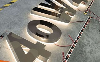
Then there is the choice of materials, which is simply a "happiness trouble". Acrylic, stainless steel, aluminum-plastic panels, PVC, wood, LED light-emitting modules... Each material has its own temperament and value. It is also a luminous letter. The resin letter looks full and high-end, but the price is also "good-looking"” ; Mini lettering is exquisite and suitable for details, but it cannot handle content that is too complex. Stainless steel can be painted or brushed, and the texture is completely different. At this time, the designer (or experienced production master) has to be like a budget-conscious butler, working within the customer's budget and budget. To find a balance between the desired effect and the test of the outdoor environment (such as sun, rain, and wind resistance), either the most expensive or the best is the most suitable. Sometimes customers insist on using a certain material that looks beautiful but is delicate, and we have to persuade them carefully.: “Sister, if this is installed outdoors, it may fade and deform after being exposed to wind and rain for two years. We might as well consider this. Although it is more simple, it is durable. ” This kind of advice based on experience is more practical than any fancy renderings.
Let’s talk about craftsmanship. Nowadays, signs are no longer as simple as painting a piece of wood and writing a few words. They include engraving, bending, welding, painting, laminating, lighting and cloth splicing, UV printing... The process links are intertwined. A beautiful curve on the design draft may require a skilled master to carefully "break" it out with a bending machine. ; A gradient color effect may have strict requirements on the accuracy and ink of the printer. We often encounter that the design drawing looks extremely cool on the computer screen, but when it comes to the actual process, either the cost is skyrocketing, or it cannot be realized at all. The "designer" in the advertising shop often has to be a "craft understander" who knows where the boundaries of design are and how to play within the limitations of the process. This kind of pull and compromise between ideal and reality is a "hidden effort" that laymen cannot see.
.jpg)
Another key point is the "pre-design" of the installation. No matter how perfect a sign is in the store, if you don't think about how to install it safely and beautifully on the wall or column, then everything is in vain. How will the structure bear the force? How to make embedded parts? How to route the power cord so that it is concealed and safe? Especially in some weird installation locations (such as curved walls, glass curtain walls, and high altitudes), the installation plan even needs to be determined at the early stage of design. An ingenious structural design is more important than the design of the sign itself. It determines whether the sign is stable, flat, and can withstand the test of time. This work requires some structural thinking and even some basic architectural knowledge. It is not just about software.
So, despite the small appearance of the advertising store, it is actually a miniature "creativity-production-engineering" integration center. From capturing the customer's flash of inspiration, to turning it into an executable design that takes into account both beauty and practicality, to choosing the right materials, mastering complex processes, and finally planning how to make it take root steadily - every link requires experience, patience and a little bit of "craftsman" persistence.
Next time you pass by an advertising store and see the semi-finished signs being carved or welded inside, you might want to take a second look. It is not just a "sign" waiting to be hung up. It may contain all the expectations of a small store for business, and the traces of repeated trade-offs between designers and workers. It also hides those inconspicuous but crucial simple wisdom about how to make an idea "live" well and live long in the real world. In the final analysis, signage design is a practical art that connects business, vision and life, and the advertising shop on the corner is where this art takes place in the most direct and pyrotechnics.

